

Kathleen Stansberry, assistant professor of strategic communications, walks you through some prime examples of how data about COVID-19 can be misleading and even harmful.
The rapid spread of the novel coronavirus 2019, or COVID-19, and its far-reaching impact on the lives of millions has captivated the attention of the world. There’s ample data being gathered and offered about how it has moved from country to country, the effect it has had to many aspects of society and how it compares to other outbreaks and pandemics.
Kathleen Stansberry, assistant professor of strategic communications, notes that while there’s a wealth of data out there, some are presenting it in ways that are confusing or intentionally misleading.
“A lot of the data related to coronavirus outbreaks is publicly accessible, and I’m a huge proponent of open data,” Stansberry says. “In a lot of ways this is great. But what I’m starting to see is there are a number of ways people are communicating information about COVID-19 that while true, while factually accurate, are not actually truthful.”
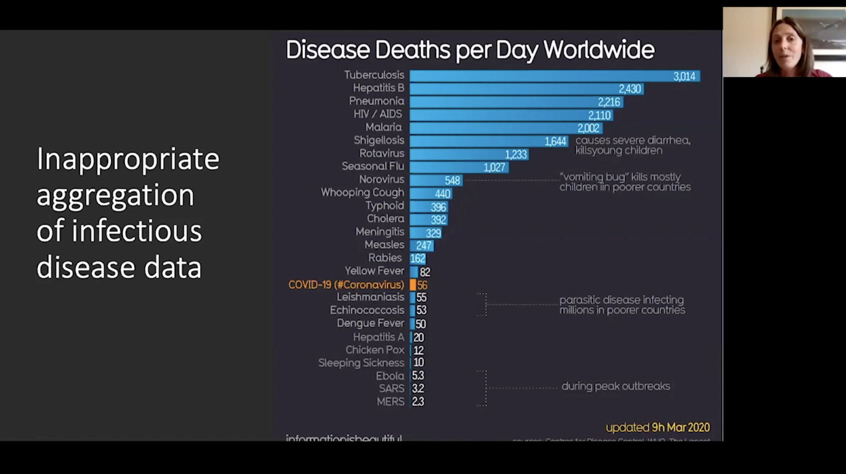
Drawing from examples students in her Media Analytics class have gathered, Stansberry says one example is in appropriately aggregating infectious disease data. In particular, comparing worldwide deaths from COVID-19 to those from other diseases, such as seasonal flu, misrepresents the nature of COVID-19 and its potential impact. While seasonal flu may kill more each year, there are vaccines and treatments for flu while medical science is still seeking ways to effectively combat COVID-19 and its spread.
A visualization comparing daily deaths from COVID-19 to other diseases can minimize the effect of COVID-19, Stansberry said. “It can an effect on people’s actions if they think it’s not such a big deal,” Stansberry said.
Stansberry also points to inaccurate comparisons between the number of cases in one location and another while ignoring the differences between those places. For instance, a comparison between the number of cases in France and the number in New York. “This was a visual that ignores demographic information, how these two locations differ from one another, what the age of the populations are, the density of populations in those areas,” Stansberry said. “It’s making a direct comparison that’s true but not truthful.”
Stansberry offers more examples of misleading data presentations, and some guidance on how to take a discerning look at COVID-19 in the video above.