Elon’s visual identity comes to life through thoughtful use of logos, typography, photography, color and design. Consistently applying these elements helps reinforce the university’s reputation for excellence and ensures that every communication reflects the quality and character of an Elon education. Use the following guidelines to create clear, effective materials that visually represent the university with pride and purpose.

Best Practices

Elon University marks are available in multiple formats to suit different design needs. Use the examples below to guide proper usage and ensure each format is applied correctly.

Cover of a Honors and Fellows Programs brochure

Brochures and Booklets: The wordmark can be screened back and used as a supporting element only if the Elon signature is present; in this case the horizontal signature is used at the top.

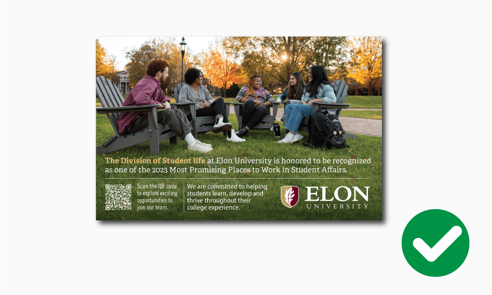
Example of Elon University postcard

Print Ads: The primary signature must be used for all external advertising to ensure consistency of presentation. Use primary signature in reverse white when on dark backgrounds, always keeping in mind the required space around the mark.

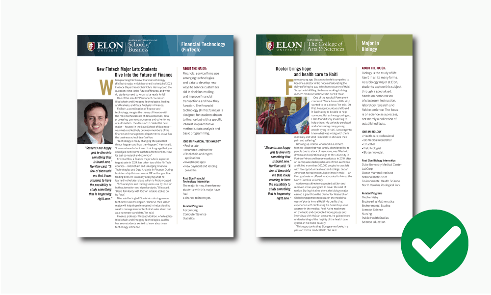
Examples of Elon University academic informational brochures

Informational Materials:School and department signatures can be used on secondary color backgrounds on fact sheets and other materials.

Example of an Elon University billboard

Billboards: The Elon primary signature should be used for public local, national and international marketing, and should be prominent and highly visible.

Avoid Improper Usages

Elon University marks should never be altered from their original format and proportions, and should never be coupled with any other graphics or marks. Please see the following examples for dos and don'ts.

Example of proper signature usage, where the graphic is unaltered

The university signature is rendered in the Bembo typeface and has been carefully spaced and typeset.

Example of improper usage of Elon signature, where the word Elon has been bolded

Do not attempt to replace the signature font by typing it or change the proportion of the signature elements.

Example of proper usage of the Elon shield, where the leave is lighter than the background.

Use the proper outline version of the shield when printing in single color. The leaf must always be lighter than the shield background.

Example of improper usage of the Elon shield, where the leaf is darker than the background

Do NOT reverse the shield when printing in a single color on dark background. The leaf must always be lighter than the shield background.

Example of proper usage of the Elon Signature, where there's plenty of contrast with a photo background

When placing the signature on a photo background, make sure there is enough contrast so the mark is clearly readable.

Example of improper usage of the Elon signature, where there's not sufficient contrast on a photo background

Do not place the signature on a photo that blends in with the mark.

Example of proper usage of the Elon signature, where the background does not interfere with the readability

Make sure backgrounds do not interfere with the readability of the signature.

Example of improper usage of the Elon signature, where background textures or colors make the mark difficult to read

Avoid placing the signature on photos, textures or colors that make the mark difficult to read.

Example of improper usage of the Elon signature, howing the background color is too similar with the mark making it difficult to read

Make sure background color is not too similar to our maroon when using our standard signature.

Example of proper usage of the Elon signature, showing sufficient contrast between the mark and the background color

Use reverse version of our standard signature when placing it on a color similar to our maroon.

Accessibility

Elon University is committed to fostering an inclusive digital environment that ensures equal access to information and resources for everyone. An accessible digital experience ensures that all users, regardless of their abilities or assistive technologies, can interact with and understand your content.

University Communications’ Accessibility Toolkit is designed to empower faculty, staff and students to create accessible and compliant content for our university’s website, emails and other digital materials.

The toolkit offers a comprehensive overview of accessibility principles; provides guidance on website, email and PDF accessibility; and shares a library of additional resources.

Access the complete Accessibility Toolkit 

Learn more about accessibility at Elon 

Choosing the Right File Format

Choosing the right file format and color profile ensures Elon’s brand looks sharp, accurate and professional across all platforms. Each application — print, web, video or promotional items — has specific requirements, and the wrong format can cause distorted colors, blurry graphics or production delays. This guide explains which formats and profiles to use so you can select the right files with confidence.

File Types

There are many types of files, but all artwork can be broken into two categories: vector and raster.

Vector Artwork

Vector artwork, created in programs like Adobe Illustrator, can be resized without losing quality and recolored to meet contrast needs. Ideal for vendor orders (apparel, promo items) and online graphics (icons, signatures) that must work on multiple backgrounds. These include:

  • SVG files are RGB vector images best for digital use. These files may be enlarged and reduced without affecting image quality. It’s also possible to change the color of the vector to satisfy contrast requirements depending on the background it’s superimposed on. All Elon official marks are available as SVG files.
  • EPS files are a common vector format primarily used for printing and producing promotional materials, and should not be used for digital applications. Official Elon marks can be provided as EPS files per vendor request.
  • AI files are the native Adobe Illustrator format and should not be used for digital applications. They are best for design work and creating production-ready files, but not intended for direct use in print or digital applications. Depending on the vendor or printer being used, AI files should be converted to EPS or PDF files prior to submitting for printing.

Raster Artwork

Raster graphics are made of pixels, with resolution measured in DPI (dots per inch). Higher DPI means sharper quality, but enlarging can cause blurring or pixelation. For print or promotional items, use at least 300 DPI (never below 150 DPI); for web, export at 72 DPI.

  • PNG files have a transparent background and are ideal for digital graphics placed on an existing background, such as websites. These images may be reduced but never enlarged, as quality will diminish. All Elon official marks are available as PNGs.
  • JPG files are the most common image type and always built with a background color (including white). JPGs can be used digitally, and for print (at the proper resolution). All official Elon marks are available as JPGs.
  • PDF files are a general document type that can contain both vector and raster graphics, and are typically used for single or multiple page documents, such as fliers or brochures. PDFs can be exported from most Adobe and Microsoft software, as well as Adobe Express and Canva. When used for print or promotional item production, PDFs should follow the same minimum resolution guidelines. When provided digitally, PDFs must adhere to strict ADA accessibility standards. Read more guidance here.

Color Profiles

The color profile used for artwork is determined by the files purpose:

  • CMYK colored files are intended for print, promotional or apparel items only.
  • RGB colored files are intended for digital use, such as websites or emails.
End Use or Product EPS JPG PNG PDF
Banners/signs
Brochures, booklets, print materials
Embroidery
Online (html emails, website, etc)
Promotional items
Screen Presentations
Silkscreening
Video
Word documents (standard)
Software EPS JPG PNG PDF
Adobe AfterEffects
Adobe Illustrator
Adobe InDesign
Adobe Photoshop
Adobe Premier Pro
Canva
Microsoft Excel
Microsoft PowerPoint
Microsoft Publisher
Microsoft Word
  • – Recommended file type
  • – Optional file type

Using Canva? When creating designs in Canva, always export as PDF for print to ensure high-quality resolution. Downloading as PNG or JPG can lead to blurry or pixelated results, especially when printed. For the best outcome, choose PDF Print with crop marks and bleed if available. Learn more.