Accordions
Use an accordion to organize content into expandable sections. Good for short answers, definitions or steps. If you’re not familiar with how components work in Elon’s WordPress or need help with creating and placing them on a page, refer to the Components documentation before continuing.
Accordion Component Settings & Options
This screenshot shows the available settings for the Accordion component. The numbered list below explains each field.
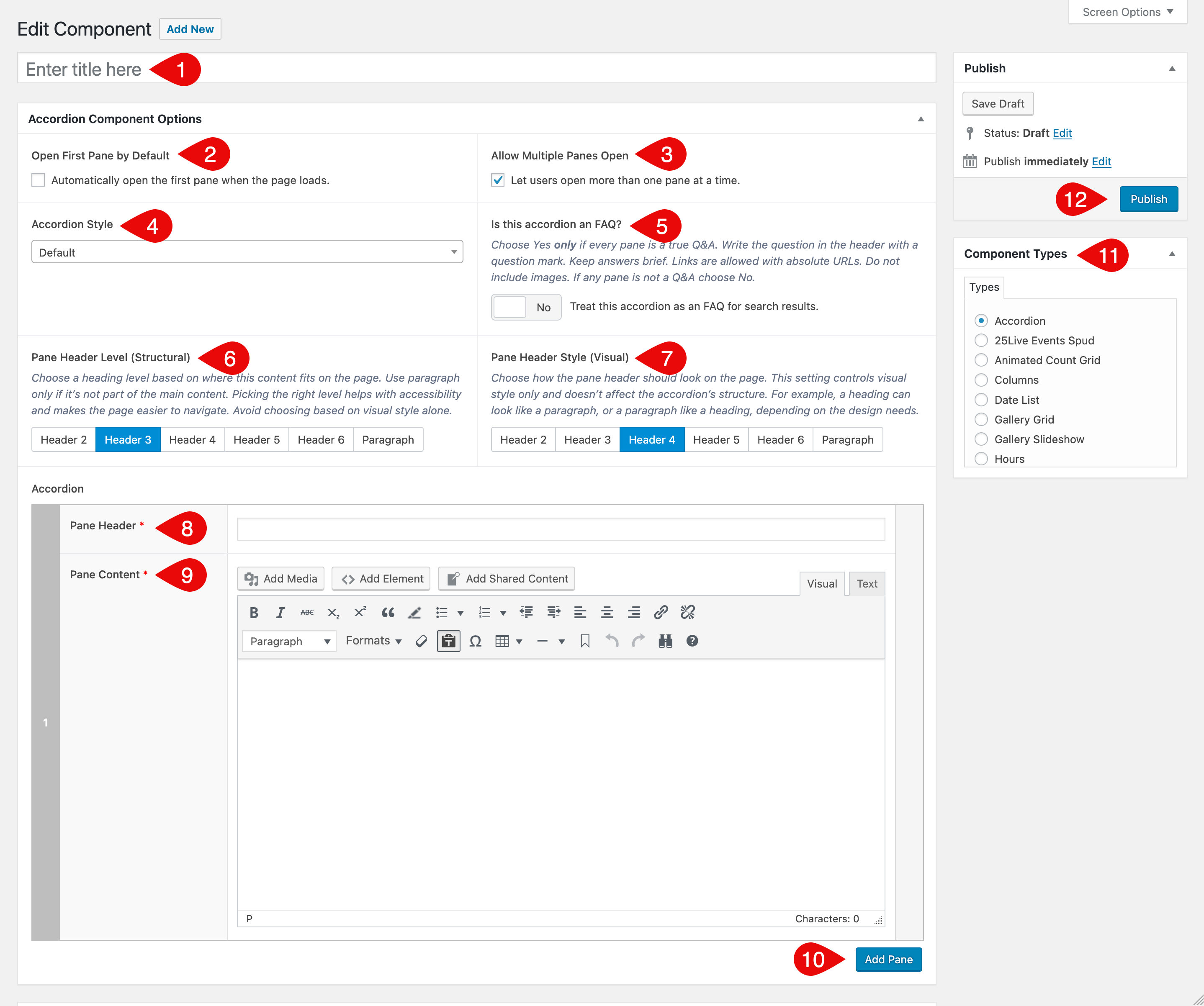
- Component Title: Internal title only; it does not display on the page. Appears in the Component selection list and as the name shown in the shortcode on pages, so you can quickly find and edit the correct component.
- Open First Pane by Default: Automatically opens the first pane when the page loads.
- Allow Multiple Panes Open: Lets users keep more than one pane open at a time. If off, opening a pane closes the previous one.
- Accordion Style: Visual style for the accordion. Available options:
- Is this accordion an FAQ?: Marks this accordion as questions with answers so search engines can understand it as an FAQ, which can qualify the page for enhanced results. Choose Yes only if every pane is a true Q&A. Write the header as a question with a question mark. Keep answers brief. Links are allowed with absolute URLs. Do not include images. If any pane is not a Q&A choose No.
- Pane Header Level (Structural): Sets the HTML heading level used for each pane header. This defines the page outline for screen readers and keyboard navigation, so match the level to nearby headings on the page. Use Paragraph only if the accordion is not part of the main content hierarchy. Keep levels logical and do not skip.
- Pane Header Style (Visual): Controls how the header looks. This affects appearance only and does not change structure. For accessibility, rely on Pane Header Level for the page outline and use Style for size and weight only.
- Pane Header: The clickable text that opens the pane. Keep it short and clear. Do not add links.
- Pane Content: The content revealed when the pane opens. Use short paragraphs or lists. For FAQs, write concise answers and use descriptive link text. Avoid large images.
- Add Pane: Adds another pane to the accordion. Keep sets focused and grouped by topic when helpful.
- Component Types Metabox: Lists all available components. Choose Accordion when creating a new component. For creating and placing components, see the Components documentation.
- Publish Metabox: Save as draft or publish when ready.
Best Practices
For Any Accordion
- Use an accordion when it helps users scan and choose what to read, not to bury required information.
- Keep panes focused on one idea. Aim for short headers and short content.
- Order panes logically: most common or time-sensitive first.
- Headers should be clear and predictable. For non-FAQ content, use front-loaded headers that start with the key subject so users can scan quickly. For example: Parking permits rather than How do I get a parking permit.
- Do not put links or buttons in the header. Put interactive elements in the pane content.
- Limit the size of a set. If you have a large number of panes, split them into a few accordions by topic. Add a short heading above each group so users know what is inside.
- If you include images in non-FAQ accordions, add alt text and keep file sizes small. Use images only when they add value.
For FAQ Accordions
- Every pane must be a real question and answer. Write the header as a full question with a question mark. For example: How do I get a parking permit?
- Keep answers tight: 40–120 words, or 3–6 short bullets.
- Lead with the answer in the first sentence, then add one sentence of context if needed.
- Links are allowed. Use absolute URLs and descriptive link text. Aim for one or two links per answer.
- Avoid images in FAQ answers.
See Examples
Visit the Example Accordions page for live demos of styles and behaviors.