Buttons
The Button Advanced Element allows you to create clickable buttons that maintain the styles specified in Elon’s style guide. They are typically used as a “call to action”, or an element that is designed to solicit an action from the visitor. A button can include only the link text, or “label”, or be accompanied by an icon that helps identify the action you’re requesting of the visitor.
Buttons should be used sparingly to ensure they stand out, indicating the link is of importance. Common examples include: “Register Now”, “Apply”, “Learn More”, etc.
Buttons should not be used to create long lists of links to other content.
Button Examples
Adding a Button
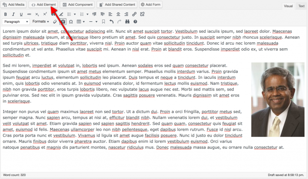
Place your cursor on an empty line in the Rich Text Editor body.
Click the Add Element button located above the Rich Text Editor buttons.
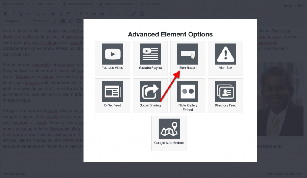
Click the Elon Button icon in the Advanced Elements selection tool.
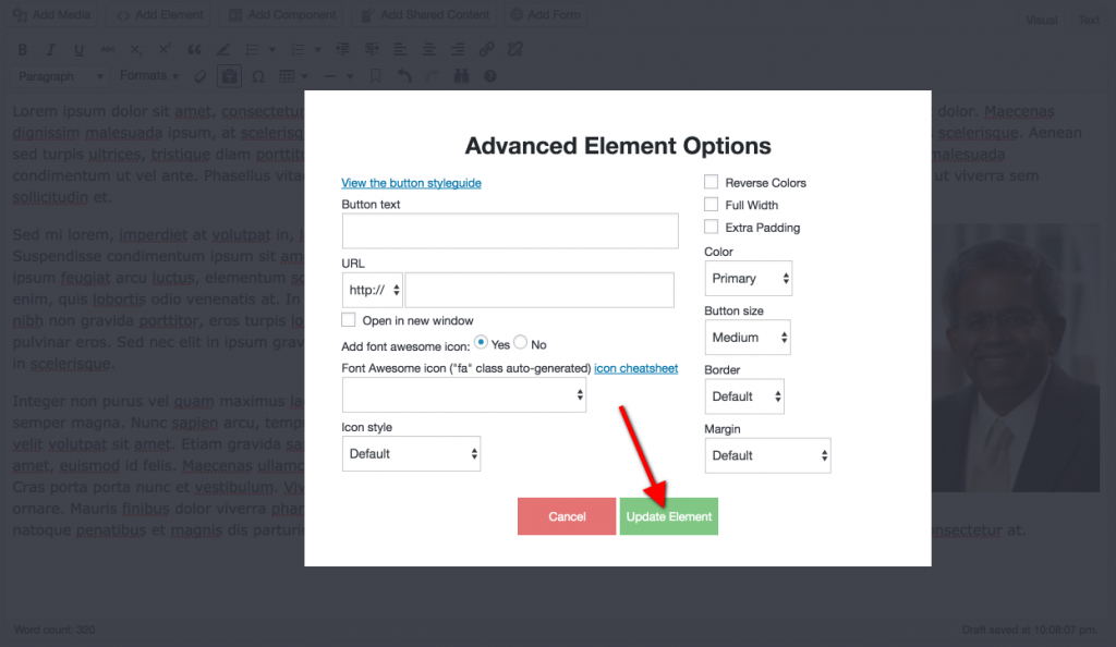
At a minimum, enter Button Text and a URL.
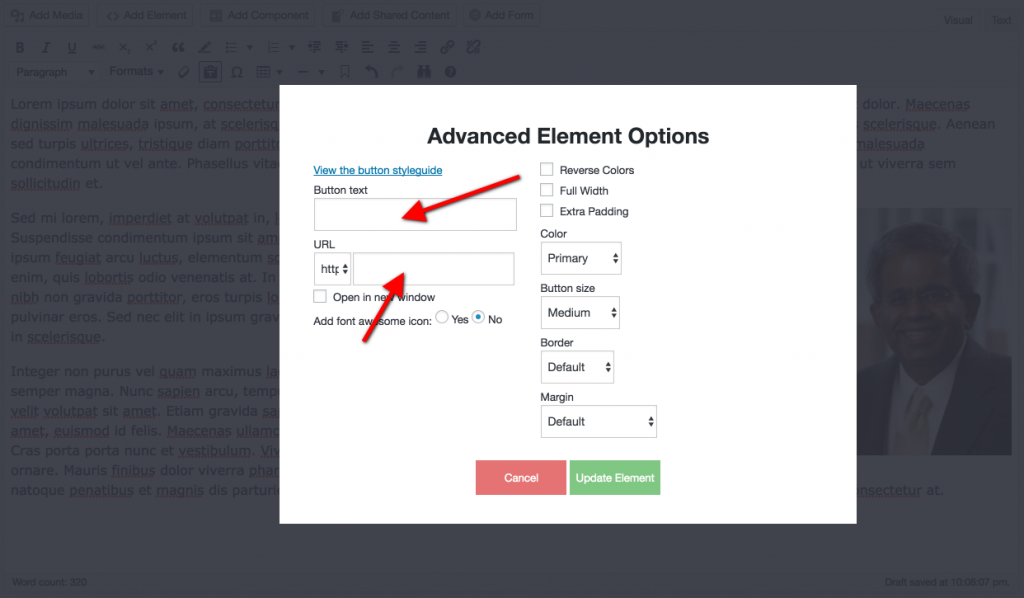
Select any other options (detailed below) to customize your Button. When you’re done editing your Button, click the green Update Element button.
Detailed Button Options
- Button Text: The text that will display inside the Button.
- Link Protocol: Select http:// or https:// depending on the protocol of the URL you’re entering.
- URL: The full URL (web address, for example: https://www.elon.edu) of the page/site you’re linking to.
- Open in new window: Checking this box will open the link in a new tab/window when the visitor clicks the Button.
- Add font awesome icon: Choosing “Yes” will display options for adding an icon to your Button. Choosing “No” will remove these options.
- Font Awesome icon: Clicking this drop-down will display a list of available icons. We use the Font Awesome icon library which you can view here.
- Icon style: Change the position of the icon within the Button.
- Reverse Colors: Checking this box will reverse the colors of the Button. For example, the Button will appear as a solid color in its default state and change to a white background on hover. Reversing the colors will change the default state to a white background, then a solid color on hover.
- Full Width: Checking this box will force the Button to display the full width of the section its displayed in. By default, the Button will only display the width of the content inside it.
- Extra Padding: Checking this box will add extra padding inside the Button, making more room between the outer edge and the text/icon inside.
- Color: The color of the button. Available options are: Primary (maroon), Secondary (gray), Tertiary (orange), or Transparent
- Button Size: The size of the Button
- Border: The thickness of the Button’s border.
- Margin: The margin between the Button and surrounding content.
Editing an Existing Button
To edit an existing Button, simply double click on the placeholder for the Button you want to edit. The Button element options will display, and update the settings as necessary. When you’re finished editing, click the green Update Element button to save your changes.