Build a Resource List
Resource List Component
This page shows how to build and configure a Resource List component using the options available in the editor. Resource Lists allow you to control how resources appear on the page, including layout, filters, search and display behavior. To create a Resource List, go to Components > Add New, then choose Resource List as the component type.
If you’re not familiar with how components work in Elon’s WordPress or need help with creating and placing them on a page, refer to the Components documentation before continuing.
If you don’t see Resource List as a component type option, the Resource Manager plugin may not be enabled on your site. Review the Resource Manager plugin documentation before continuing.
Content Settings Tab
This screenshot shows the Content Settings for a Resource List. The steps below explain each part.
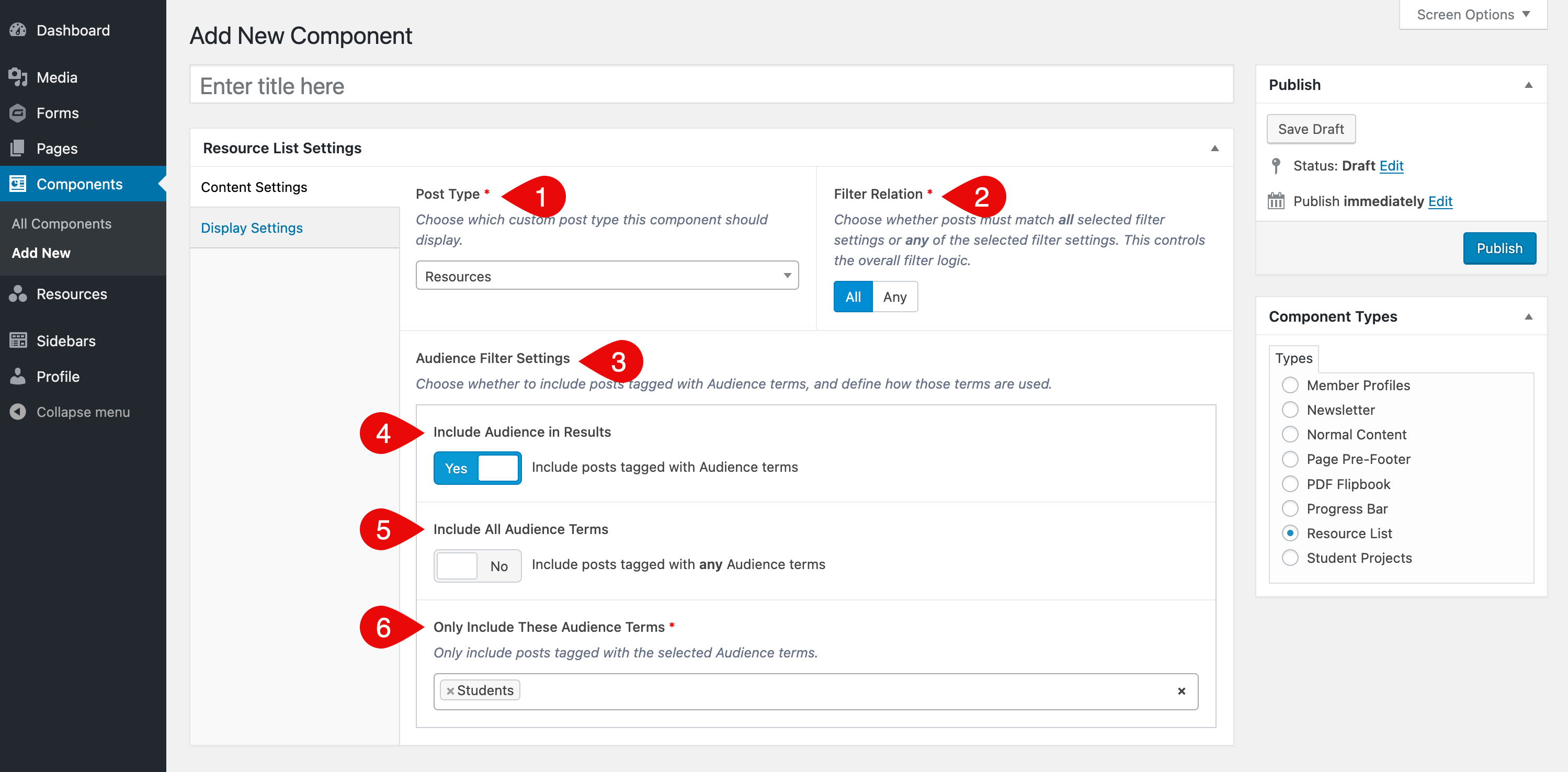
- Post Type: Choose the type of resource you want to display (for example, Resources, Documents or Policies). This controls which resource items will be included in the list.
- Filter Relation: Choose All if items must match all selected filters, or Any to include items that match any selected filter.
- Filter Group Settings: For each available filter group, a group of settings will appear. These allow you to control whether and how the group’s terms affect what appears in the list. The next three fields repeat for every filter group linked to the selected post type.
- Include Group in Results: Turning this on includes items that have one or more terms assigned from this filter group. Turning it off will ignore this filter group entirely.
- Include All Terms: When enabled, any term from the group will qualify a resource to be included. When disabled, you can choose specific terms to include.
- Only Include These Terms: Select one or more terms from the group to narrow results. Only items with at least one selected term will be included.
Display Settings Tab
This screenshot shows the Display Settings that control how the Resource List appears on the page.
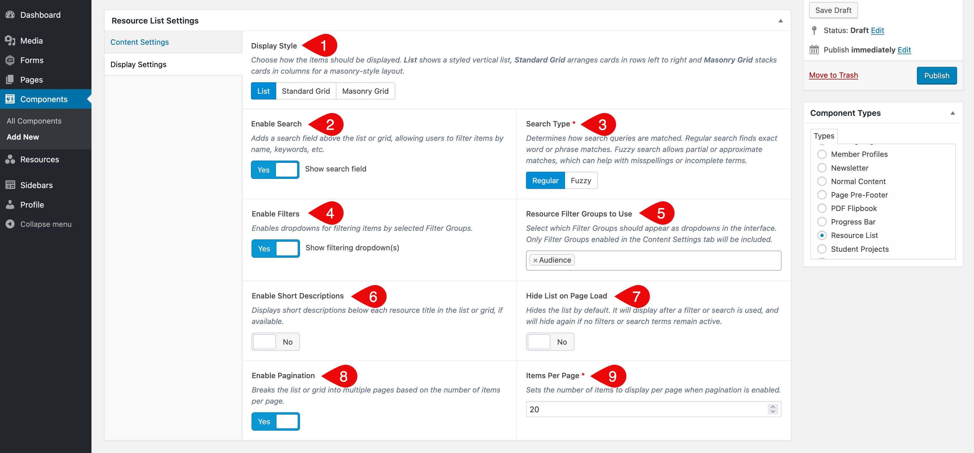
- Display Style: Choose between List (a vertical list of resources), Standard Grid (cards arranged in rows left to right) and Masonry Grid (cards stacked in columns for a masonry-style layout). Additional options appear when either grid style is selected (see Additional Grid Display Options below).
- Enable Search: Adds a keyword search field above the list or grid.
- Search Type: Choose Regular for exact matches or Fuzzy to allow broader results and partial terms.
- Enable Filters: Adds a dropdown for each filter group selected in the Filter Groups to Use field.
- Filter Groups to Use: Select which filter groups should appear as dropdowns above the list or grid. The label for this field may include the name of your resource type (for example, Resources Filter Groups to Use or Policies Filter Groups to Use). Only groups enabled in the Content Settings tab will be available.
- Enable Short Descriptions: Show the short description beneath each resource title if available.
- Hide List on Page Load: Hides the list until a search or filter is used. Useful for long pages or targeted lists.
- Enable Pagination: Breaks large lists into pages.
- Items Per Page: Set how many resources to display per page if pagination is enabled.
Additional Grid Display Options
If you select Standard or Masonry Grid as the Display Style, two additional settings will appear. These control the heading structure and visual appearance of each resource title.
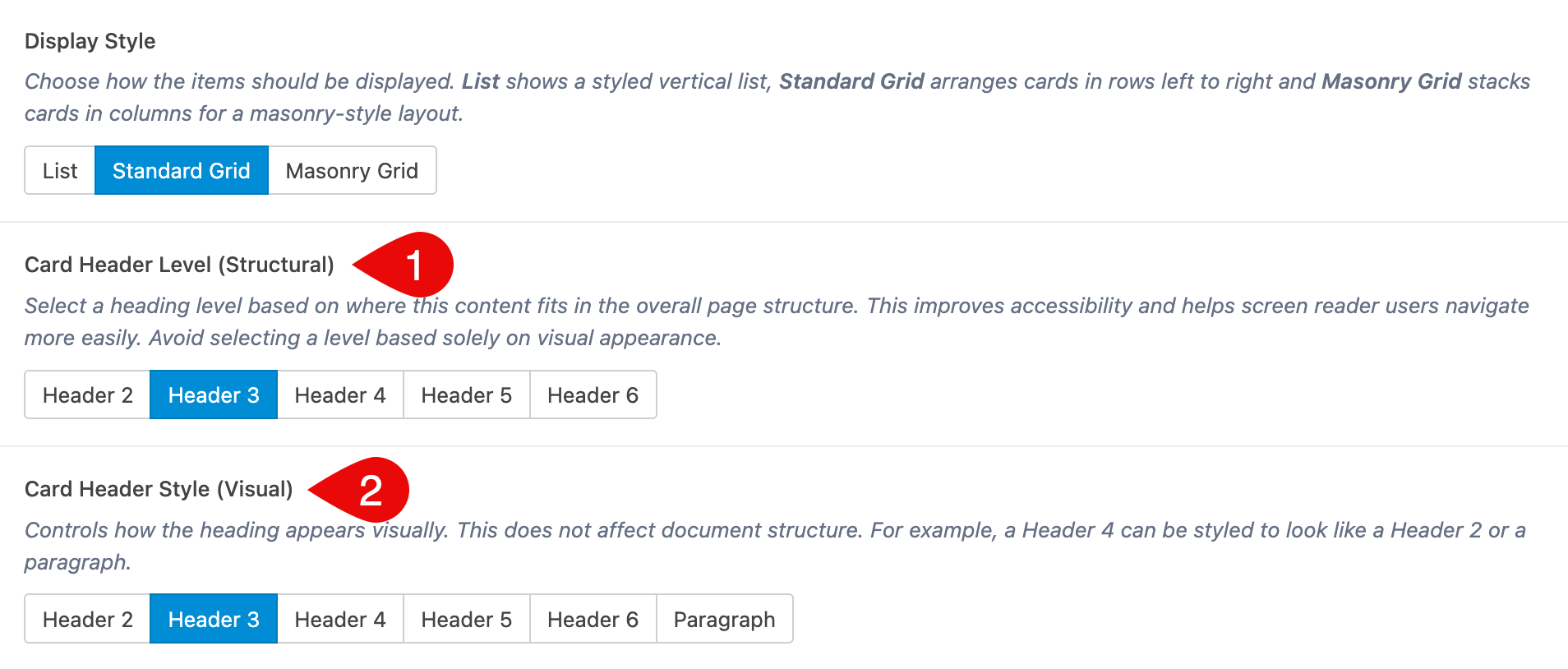
- Card Header Level (Structural): Select the heading level that fits your page’s HTML structure. This improves accessibility and helps screen reader users navigate easily. Avoid choosing a level based on how it looks. This setting is for structural hierarchy only.
- Card Header Style (Visual): Controls how the heading looks on the page. This does not affect the heading structure. For example, you can make a Header 3 look like a Header 2 or a paragraph.
See Examples
Visit the Example Resource Lists page to preview a finished grid and list, and to compare search and filter settings.