Add a New Resource
Editor Walkthrough
This screenshot shows the resource editor used for adding a new item or editing an existing one. The steps below explain each part.
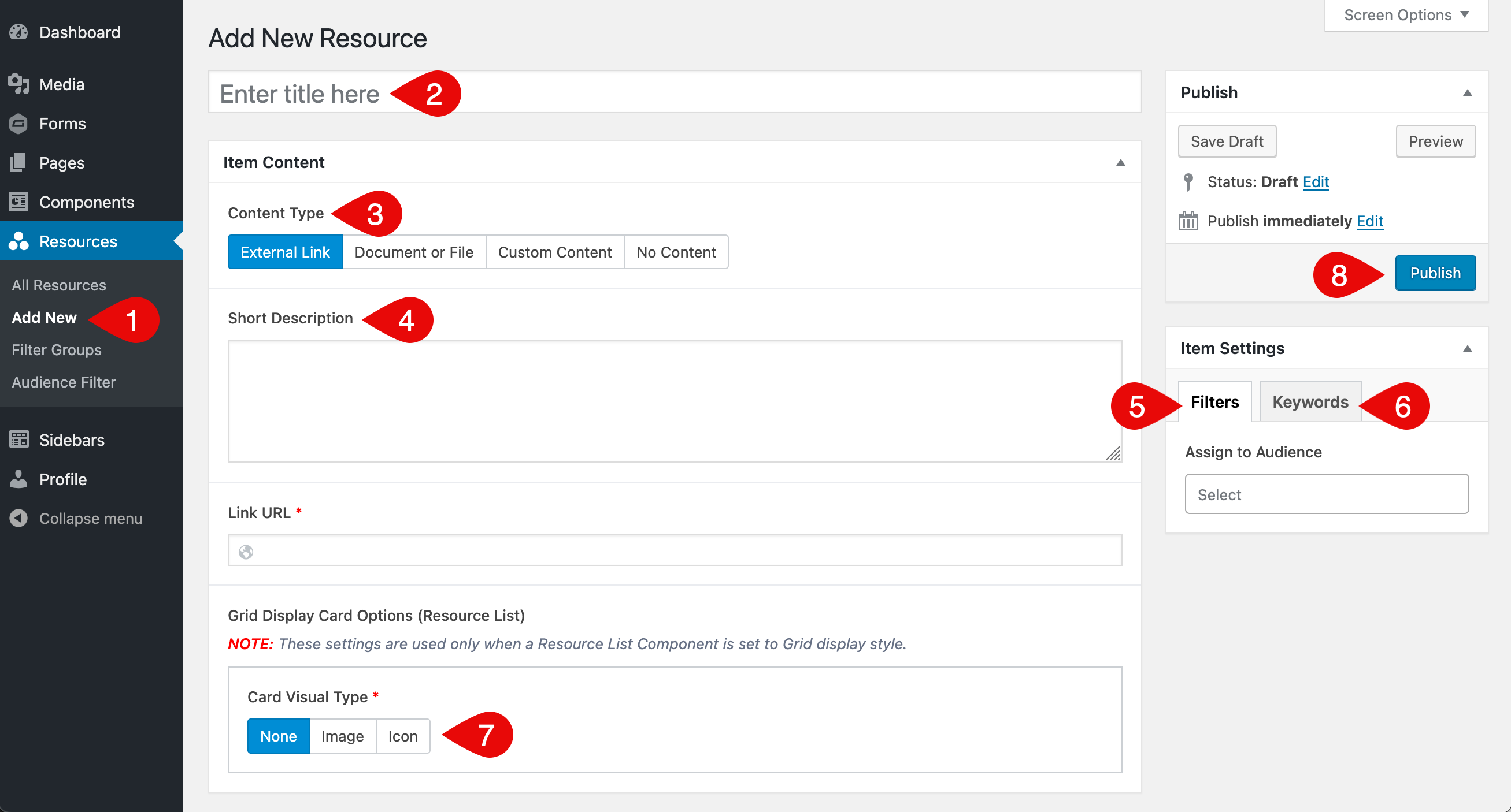
- In the admin menu on the left side of the Dashboard, hover over the section labeled for your resources (for example Resources, Documents, Policies or another name your site uses), then click Add New when the submenu appears.
- Enter a title for the resource.
- Under Content Type, choose the option that best matches the type of resource you are adding (each option displays different fields, which are explained in the Content Type Fields section):
- External Link: a link to a page on your site or another website
- Document or File: one or more documents or files, either uploaded or linked
- Custom Content: text, images or other content you enter directly in the editor
- No Content: title and filters only, with no additional content
- (Optional) Add a short description in the text field.
- In the Filters tab, choose any terms that apply from the available filter groups.
- (Optional) In the Keywords tab, add keywords separated by spaces (not commas) to help with search.
- Review the Grid Display Card Options. These settings only apply when the resource is shown in a grid-style list. The fields in this group are explained in the Grid Display Card Options section.
- Click Publish to save and make the resource live.
Content Type Fields
Each Content Type displays a different set of fields in the editor. The sections below show what appears for each option along with short descriptions of each field. Screenshots are included to help you identify what to look for. Click any image to zoom in.
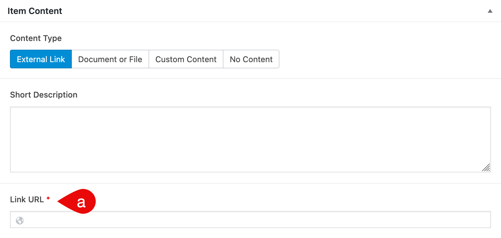
External Link
This option allows you to link directly to a page on your site or another website.
- Link URL: Paste the full web address of the page you want to link to. This is a required field.
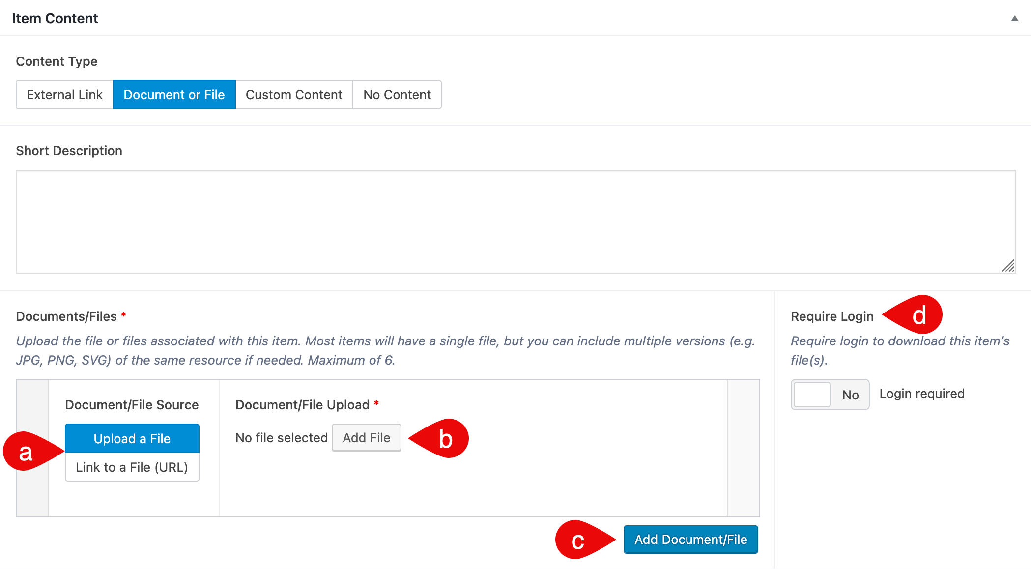
Document or File
Choose this option to upload files or paste file URLs. You can include multiple versions (like PDF, PNG or SVG), and decide whether login is required to access them.
- Document/File Source: Choose whether you want to upload a file or link to one using a URL.
- Document/File Upload or URL:
- If Upload a File is selected: upload a new file or select one from the media library (20MB limit). This is a required field.
- If Link to a File (URL) is selected: paste the full web address of the file. This is a required field.
- Add Document/File: Adds another file entry to the resource. You can include up to 6 files per resource.
- Require Login: Enable this if all files in the resource should only be accessible to logged-in users.
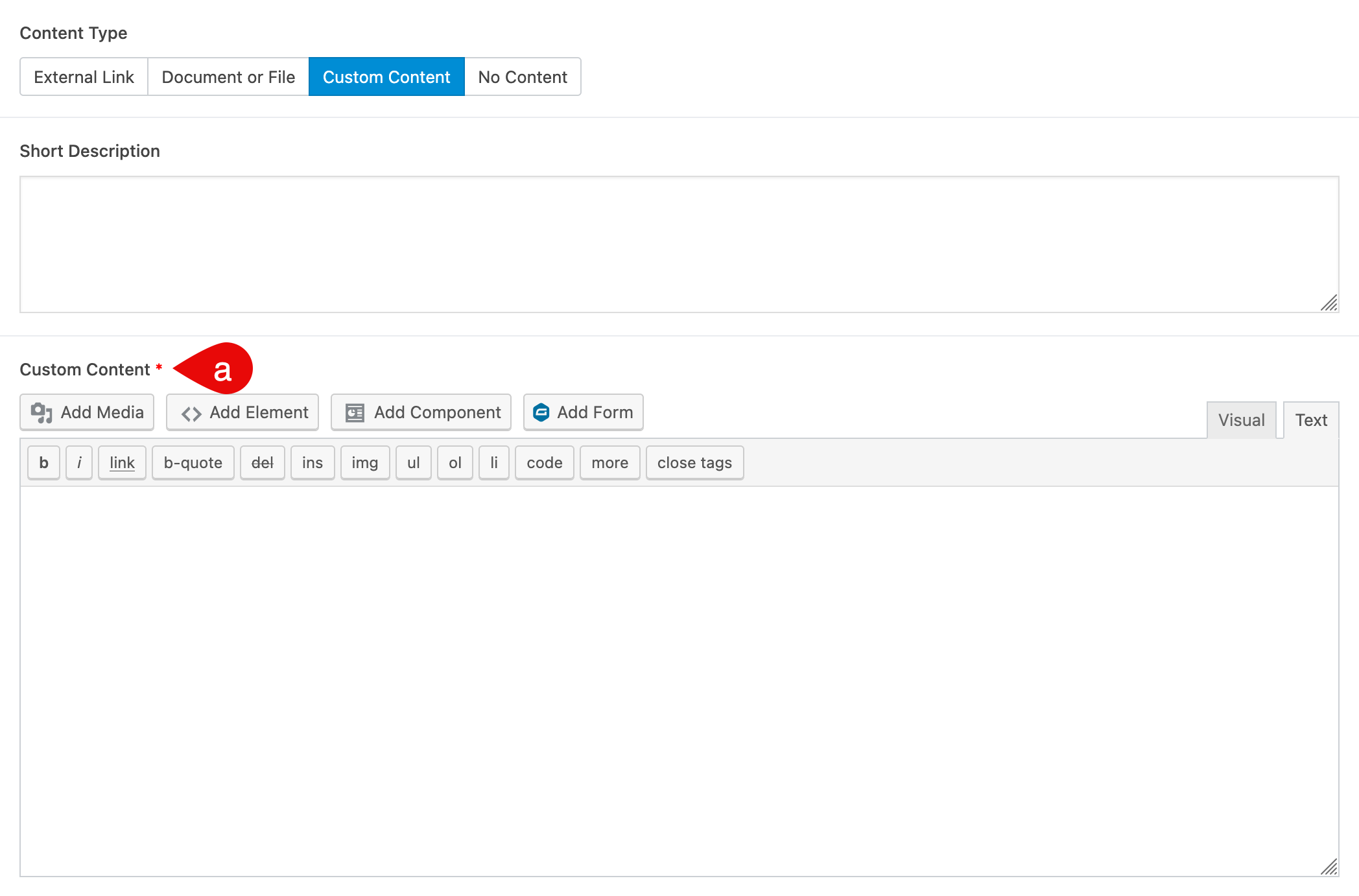
Custom Content
This option displays a content editor where you can enter text, images, components or forms.
- Custom Content: Use the editor to enter your content directly. You can format text, add media or insert components using the buttons above the editor.
No Content
No additional fields are shown when No Content is selected.
Grid Display Card Options
These settings control how the resource appears in a Resource List component when Grid view is selected. They are not used in List view.
The fields shown depend on the selected Card Visual Type. Screenshots are provided for each option. Click any image to zoom in.
None
If None is selected, no icon or image is shown on the card.
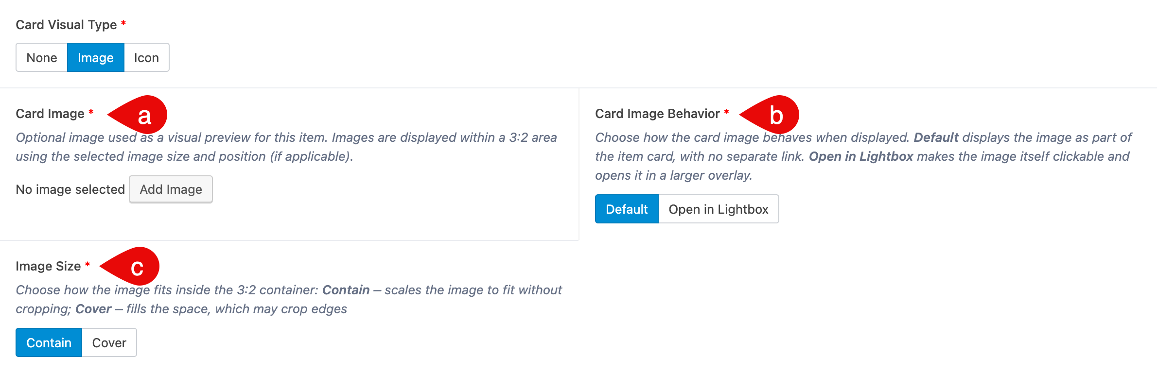
Image
Selecting Image allows you to upload or choose a visual preview for the resource card.
- Card Image: Upload or select an image to show at the top of the card. A square or horizontal image works best.
- Card Image Behavior: Choose how the image behaves.
- Default: the image is part of the card and not clickable
- Open in Lightbox: clicking the image opens it in a larger overlay
- Image Size:
- Contain: scales the image to fit without cropping
- Cover: fills the space, which may crop the image edges
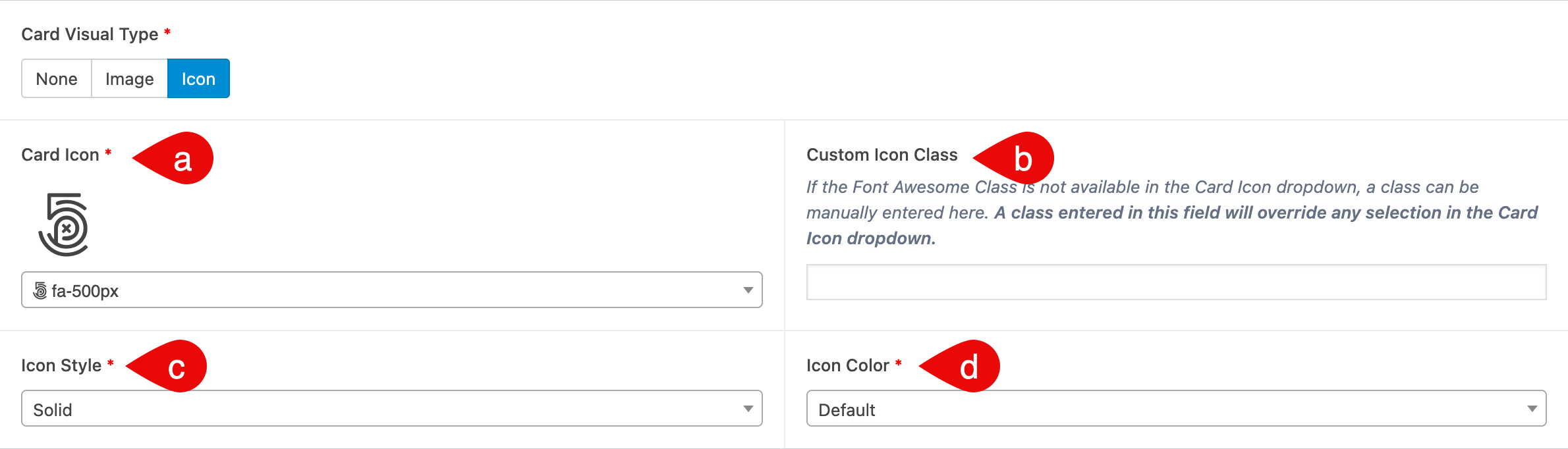
Icon
Selecting Icon displays a symbol instead of an image at the top of the card.
- Card Icon: Choose an icon from the dropdown to represent your resource
- Custom Icon Class: Optionally enter a Font Awesome class manually. This will override the icon selected above
- Icon Style: Select an icon style, such as solid or regular
- Icon Color: Choose a color for the icon display
What’s Next
After you’ve added your resources, the next step is building a Resource List to display them on your site. Visit the Build a Resource List page to learn how to set it up using filters, layout options and more.